

Force the mobile overlay menu on desktop in Squarespace
Enable Overlay Menu on Desktop without CSS
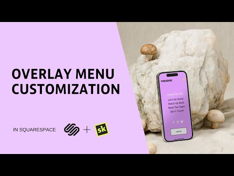
Fully customize your Squarespace 7.1 mobile overlay menu and force the overlay menu on desktop without a line of code and fully customize your mobile menu.
If you have built with Squarespace you will be familiar with their fantastic overlay menu which by default is enabled on tablet and mobile devices. In this video we will show you how to transform your whole website navigation by bringing the overlay menu to desktop screen sizes.
Highlights:
0:00 - Introduction
0:31 - Enable Desktop Overlay Menu
1:04 - Hamburger Alignment & Slide Direction
1:17 - Menu Width, Alignment & Background

Customize Overlay Menu on Mobile & Desktop
In this video, we are going to look at how to use SquareKicker to customize the mobile overlay menu including features like color, opacity, font styling, hover color and more.
On the site shown the mobile menu has been enabled on desktop using the SquareKicker Desktop Overlay Menu tool. To see how to add this feature head to the Desktop Overlay Menu tutorial above.
Highlights:
0:00 - Introduction
0:30 - Create a Custom Landing Page
0:45 - Header Tool & Visibility Options
1:15 - Customize the Hamburger Icon (Color, Size, Thickness)
1:22 - Overlay Menu Tools
1:52 - Background (Color, Opacity, Blur)
2:02 - Button Styles & Hover Color
2:17 - Navigation Links & Hover Color
2:37 - Social Icons & Hover Color
2:54 - Menu Close Icon